paul wrote:-
Looking through the trade catelogues in the archive, I noticed that the early design Proto-packaging for Series 2 originally had the white information box on the front, the same that was eventually used in Series 3.
Clearly they ditched the idea originally for Series 2, but revisited it when they brought out Series 3....
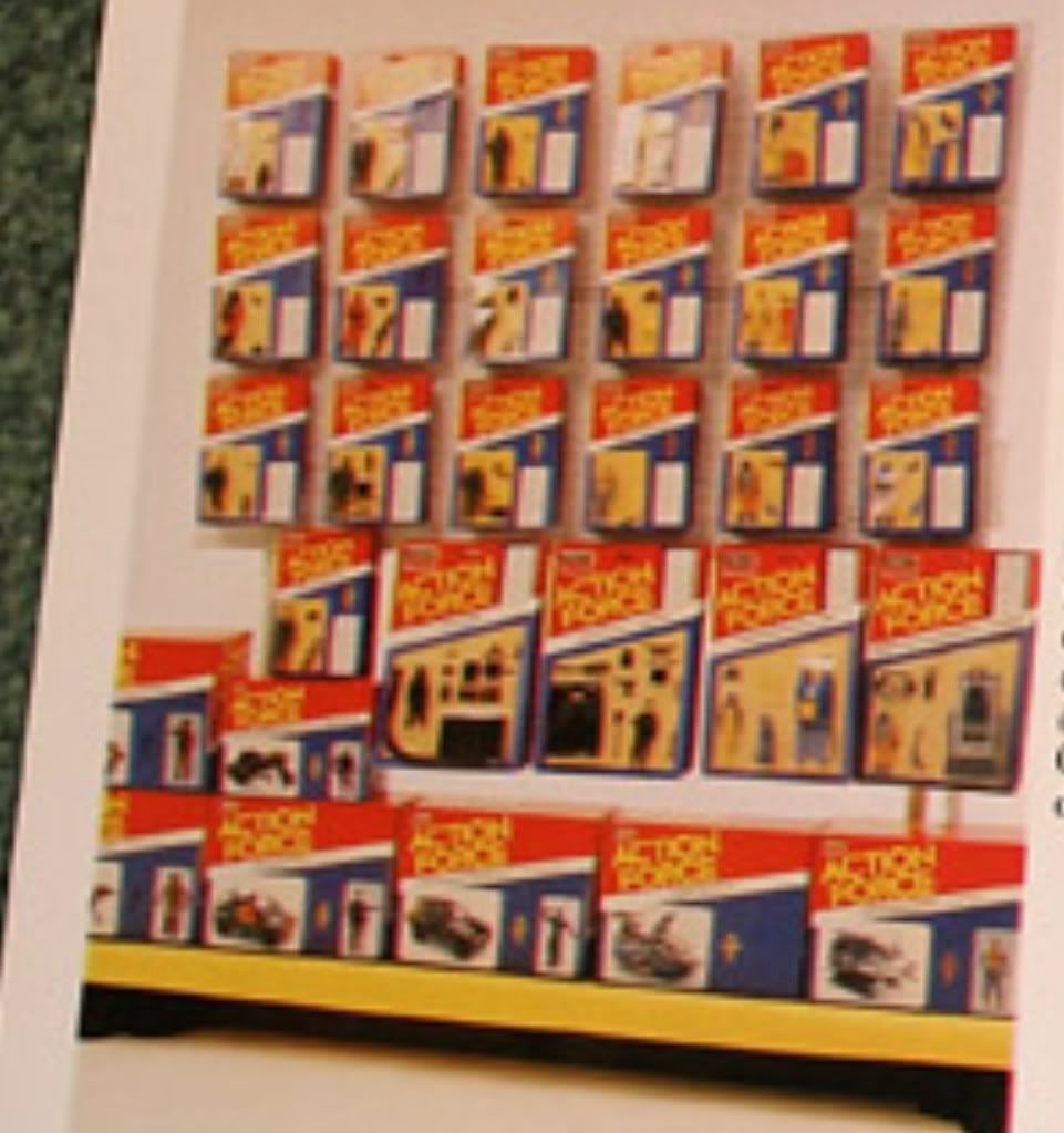
Paul, that is more likely to be generic photostat packaging to demonstrate the display stands, rather than the intended actual packaging mock ups. The idea of the filecard on the front may have been a proposed idea at the early stages, but the dagger logo I think is just copying across all the cards to save time etc. Getting stuff ready for trade catalogues was always a great rush for time, to hit deadlines, over a Christmas period and before the UK toyfair in January, so if there was a way to cut time, it's possible they would go for it (remember, the picture and text is focusing on display units and plannograms, rather than individual packaging).
This was done with a few other product lines, including Star Wars, where they would create artwork as a generic placeholder to mock up display units and plannograms, but the artwork never actually was used during the packaging creation process.
Here's a wee scoop for you, VERY few people have ever seen these, but here are a few that Palitoy done, for the same purpose during 83 for the new Jedi Toys:
B-Wing.
The sky blue background is very different to the space battle background of the released version. The toy itself looks to be an early mock up too:

Y-Wing.
Looks to be in an Endor Forest type setting, and not the bold blue of the final packaging:

Sy Snootles & The Rebo Band.
In the US, this was reeleased on a blister card, in UK and Europe, it was more like this picture in a box, but in Tri-logo branding. This example shows what the packaging could have been like if Tri-logo branding had not been applied:

However, I think there is an alternative mocked up DART, that I scanned in for Baron and maybe a few others too, (there is the Cobra Roboskull with text saying Cobra Commander on it) I'll have to check.
Dave.